home: trend [ 2019 paint colours ]
Every year we see different trending colours and popular shades in magazines and online. This last year has seen pink take over our lives, the introduction of the Millennial Pink has made way for a lot more softer shades, earthy tones and neutrals.
Of course vibrant red, teal and yellow has all made an appearance this last year inspiring those who want to be more adventureous.
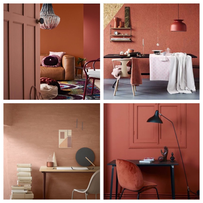
Looking ahead to 2019 we have picked out four colours from four top paint brands, with what they believe will be colours of next year.
Dulux – Spiced honey [ top right ]
This shade is full of warmth and calmness, perfect for a living room or bedroom. The warm amber tone can be worked with other shades including plums, greys, and greens to create an appealing colour pallete.
Farrow & Ball – Sulking room pink [ bottom left ]
Pink shades are hanging around and we love them. With colour inspiration coming from raw plaster, putty, and stone this pink tone is a great addition to these popular colours. This versatile shade will work in any room and create a tranquil space.
Graham & Brown – Tori [ top left ]
Moving away from the pack, G&B have gone down a more intense and rich direction with this gorgeous teal shade. Very regal and and with a luxurious quality Tori would create a striking backdrop to any room. It will also compliment the must have earthy and nuetral shades that we have previously mentioned.
Crown – Redefined [ bottom right ]
Crown have created pallets to inspire us and Redefined is the one we have chosen. Taking inspiration from terrazzo – the multi coloured marble chips – form the shades. We see whites, clay, pale grey and pinks all working together. Use these colours in blocks for impact.
dulux.co.uk
farrow-ball.com
grahambrown.com
crownpaints.co.uk

![home: trend [ 2019 paint colours ]](https://anotherhomeblog.com/wp-content/uploads/2018/11/1542359389238.jpg?w=863&h=0&crop=1)
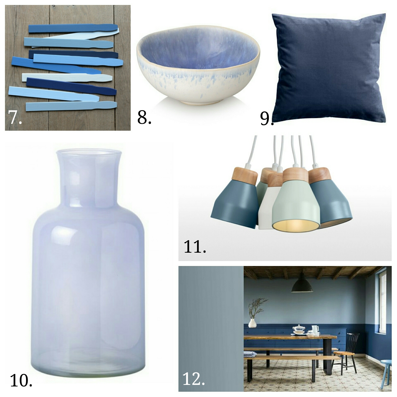
![home: trend [ denim ]](https://anotherhomeblog.com/wp-content/uploads/2016/09/1474541277820.jpg?w=863&h=0&crop=1)