Go against the grain, choose a colour that unexpectedly is making waves in the interiors world. Choose lilac.
This calming soft tone is of course reminiscent of previous decades but with a modern approach it’s a perfect new colour to use. Layered up in shades it’s cool and calm but also subtlety feminine as long as you don’t go too floral or flouncy. Stick to solid tones and gain texture from velvets and knits. Create a room with midcentury furniture in teak or walnut; and lilac will compliment with ease. Look for danish silhouettes in armchairs and sofa design and keep accessories to a minimum.
Other countries have huge influences on us and our home, and this year we have been introduced to a few. First we learnt of the Danish Hygge & Lykke, now we have Wabi Sabi – the Japanese way of thinking about our lives and homes and making them imperfect…in a good way.
‘Characteristics of the wabi-sabi aesthetic include asymmetry, roughness, simplicity, economy, austerity, modesty, intimacy, and appreciation of the ingenuous integrity of natural objects and processes’
Bowls from habitat.co.uk
There is so much presure to make our homes the best they can be, whether it’s clean lines, perfectly arranged bookshelves or neatly placed cushions. Whatever habits we have Wabi Sabi teaches us to let go a bit and feel more content.
Light from rockettstgeorge.co.uk
Wabi Sabi is about mis-matched furniture, wonky vases, worn wood floors and naturally textured accessories. Less shiny and new, more used and imperfect. There is no wrong or right way to indroduce the principles of Wabi Sabi, it’s more about appreciating what we have, and if we need those new things then perhaps opt for handmade or used items.
Not just for privacy or warmth, but the various trends for window covering options show its just as important to be a well considered interiors feature as any other parts of a room. Different coverings can create an entirely different effect and feel to a room; whether it be warm and cosy, airy and minimal, glamorous and chic, or traditional and homely.
Recent styles and choices have seen shutters being one of the most popular options, as well as Venetian blinds being a regular favourite. For a modern look, but when you need warmth combining heavy weight curtain with a blind is a great option to keep an on trend look – ensuring the curtains colour compliment the rest of the room; often a good way to introduce a texture or pattern to bring ‘something else’ to the design of the room. Venetian blinds or shutters are modern and excellent for both privacy and allowing light in but their solid look can be softened with a modern voile or net curtain. Ikea has a great choice for light weight curtains as well as quality Venetian blinds at very low prices.
An alternative to a lightweight curtain is window film. The perfect way to get minimal stylish non-fussy privacy. Nothing floating getting in the way, cost effective, easy to change, and available in such a range of patterns, styles, colours, densities and finishes.
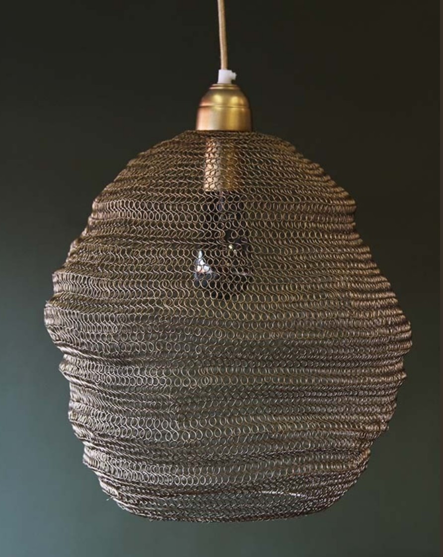
There has been a huge increase in popularity for having exposed bulbs in pendant lighting. Forgoing a traditional lamp shade for something a bit more industrial, creating a focal point in a room.
With the vintage Edison style bulbs with various filament designs still a favourite of most, we now see new adaptions of this look, still keeping the overall feel but with a modern edge.
You will see a lot more smoked finishes and tinted glass along with oversized examples, so only one large bulb is needed to fill the ceiling space. The big trend at the moment is the streamlining of the filament, creating more structured patterns and lines. And this continues with the housing of the bulbs on pendant lights. Boxes surround the bulbs, creating a faux shade and again this makes for a statement.
Copper and chrome will continue to be the most popular finish of attachments, but try something a bit different with the addition of a Plumen drop hat lamp shade – a simple disc that sits above the bulb but looks sleek and modern.
We are in agreement with the folks at Decoist blog that terrazzo is no longer just for the floor. This beautiful pattern of embedded stones is versatile for fabric, homewares and creates a modern look in the home. It’s the perfect design to sit in a minimal interior to add a delicate pattern and texture.
Across the internet and highstreet the terrazzo pattern in various colours is appearing on anything from crockery to cushions, bean bags to coffee tables.
As we have said in the past we are certainly partial to a bit of concrete and brutalism in our homes. What is great to see, is that this material is accessible to all with more stores introducting home accessories and furniture using concrete.
Last year and a large part of this year we have seen concrete sit alongside metalics, like copper, brass and gold. Now we are seeing a more sedated, subtle use of concrete mixed with glass and wood.
Of course the metal additions are still there, but more toned down, likely in brushed brass and black finishes.
The great thing about concrete is that it comes in all shapes and sizes, and works in all rooms. Vases and table tops in the living room, pendant lights in the bedroom, utensil pots in the kitchen or stationary storage in an office. The options are endless.
Image via Pinterest
Concrete lends itself really well to industrial, Scandinavian and monochrome interiors, but it can also make a statement in other settings. A concrete lamp base or table top, can be dressed up with colour and print to suit.
The real winner for using concrete in your home is to blend it with neutral tones and mixed textures. There are no rules so have a go at introducing this material into a room and we garauntee you will go back for more.
It’s cool, it’s calm and allows you to create a sanctuary in your home. Follow the cool tones trend and fill your interiors with soft greys, cool blues, gentle pinks, pale greens – and textures of knit, linen, cotton and lace.
Use along side light wood or white furniture and keep accessories minimal to not clutter the look.
If it’s got a hook on the back if it hang it! That’s the basic rule to follow, with wall decor taking on a new style.
We all love a picture wall, framed prints and photos filling a space. Nothing wrong with that, although now there is so much more to display on our walls including hanging rings, macrame, baskets and planters. It’s nothing new, but a trend emerging currently is to soften a room with neutral tones and add the hanging items with materials to compliment – woods, rope, and metals with an artisan feel, almost hand crafted.
Plants play a large part, so get some baskets or metal rings and play around with faux or real succulents to create a relaxing space – ivy is great for this.
Feathers are popular, whether in art work, embroidery or hanging decor with the softeness and intricate design bringing interest and calm to a space.
Whatever you decide, the choice is out there. A great place to start is online marketplaces Trouva and Amara.
It’s rich, but calming; readily available in homeware across the high street; easy to match up with similar hues in paint and wallpaper; and compliments well with other on trend favourites including metallic tones, monochrome or jewel tones – or you go true to the trend and have design braveness in having everything being in the teal colour! – a strong bold look.
With new colour trends appearing all the time its hard to keep up. Decorating whole rooms to the latest shades is not always an option, so instead it’s a great time to start introducing accessories and accents.
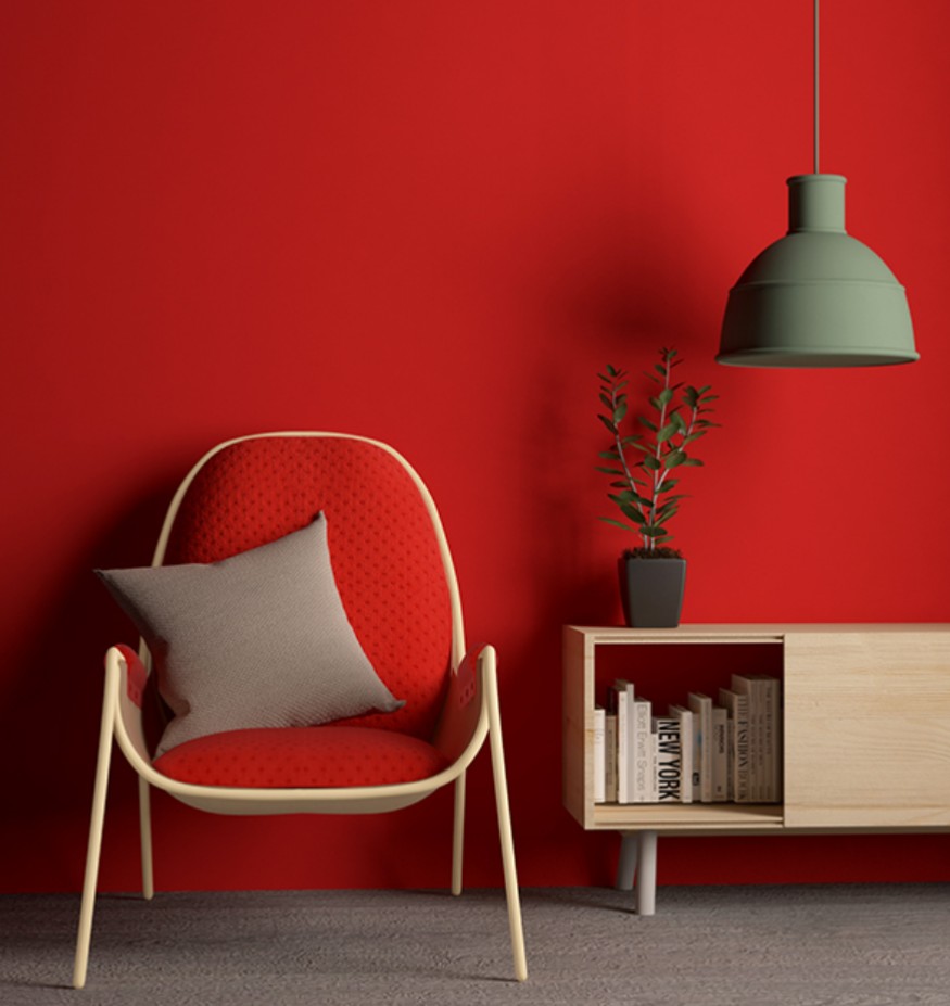
A big colour choice for now, going into next year is Red. Not an easy one to work with, so our advice is to keep it simple. Red is a colour that is going to shout out within a room, so make sure the pieces you choose enhance the space, not clutter it.
A statement clock or cabinet will draw attention in a room, as well as an armchair or sofa. Perhaps opt for a painted wall, a chalky matt finish will tone the effect down and in turn will create a more subtle finish.
Image from Pinterest
A monochrome, white walled room is going to act as the best back drop to red accessories, but an industrial look also looks great with red light fittings or tiles, ideal in a kitchen.
Whatever your thoughts on the colour Red there is no doubting it’s uplifting and fun. We are on board!

![home: trend [ lilac ]](https://anotherhomeblog.com/wp-content/uploads/2018/01/img_0664.jpg?w=863&h=0&crop=1)
![home: trend [ wabi sabi ]](https://anotherhomeblog.com/wp-content/uploads/2017/12/img_20171229_085454_152.jpg?w=863&h=0&crop=1)

![home: trend [ window coverings ]](https://anotherhomeblog.com/wp-content/uploads/2017/12/img_2788.jpg?w=863&h=0&crop=1)
![home: trend [ exposed bulbs ]](https://anotherhomeblog.com/wp-content/uploads/2017/12/img_20171215_091521_9871.jpg?w=863&h=0&crop=1)
![home: trend [ terrazzo ]](https://anotherhomeblog.com/wp-content/uploads/2017/12/img_1976.jpg?w=863&h=0&crop=1)

![home: trend [ concrete accents ]](https://anotherhomeblog.com/wp-content/uploads/2017/12/img_20171201_075750_259.jpg?w=863&h=0&crop=1)
![home: trend [ cool tones ]](https://anotherhomeblog.com/wp-content/uploads/2017/11/img_1128.jpg?w=863&h=0&crop=1)
![home: trend [ Hang It ]](https://anotherhomeblog.com/wp-content/uploads/2017/11/img_20171117_084534_881.jpg?w=863&h=0&crop=1)
![home: trend [ teal ]](https://anotherhomeblog.com/wp-content/uploads/2017/11/img_0289.jpg?w=863&h=0&crop=1)

![home: trend [ Red ]](https://anotherhomeblog.com/wp-content/uploads/2017/11/1509664061326.jpg?w=863&h=0&crop=1)